F&B TRACKER SITE
The F&B Tracker is a site aimed at providing a means of internal project management and reporting. Currently, the F&B team utilizes spreadsheets to track its project, rendering information obsolete on a weekly, if not daily basis. As a global team, there is no central repository to view each region's work, nor is there an efficient means to generate reports on current projects as well as track concepts as they're implemented across the world.
With my experience in optimizing Hilton's design studio websites, I was asked to step in and oversee the application to launch. An inherited project already two years in the making, yet still not released, I was very surprised upon my initial test drive to see that the site clearly received little attention in regards to user experience. In my own words, every area of the site made me feel like a cat that couldn't get out of a paper bag. It was time to blow the whistle.
When I began working on the original site, seen here, the visuals were off-brand for Hilton and it was difficult to understand where you were on the site at any given moment. Once within a given property, the navigational functionality began to deteriorate. A user could not easily hop back out and visit their project list or another property should they desire to do so.
Additionally, the iconography was not very intuitive and I took note of my team struggling to click through and find what they were looking for or understand where they were within the site. My goal was to look at each step of the user's journey and ensure that it could be as frictionless as possible with clear wayfinding.
While I was allowed to revamp the site, I did need to abide by the relative framework that was already established; however, I had enough leeway to map out alternatives and dramatically tweak the user journey for a positive impact on the overall experience.
In a four month time period, I collaborated with internal and external partners to course correct, holistically revamp the project, and find the horizon line for launch. Currently, we have just launched the web app as of Q1 2018. As our global team begins to test drive the site and input data on their active projects, I will be gathering user feedback and formulating enhancements for a 2.0 rollout.
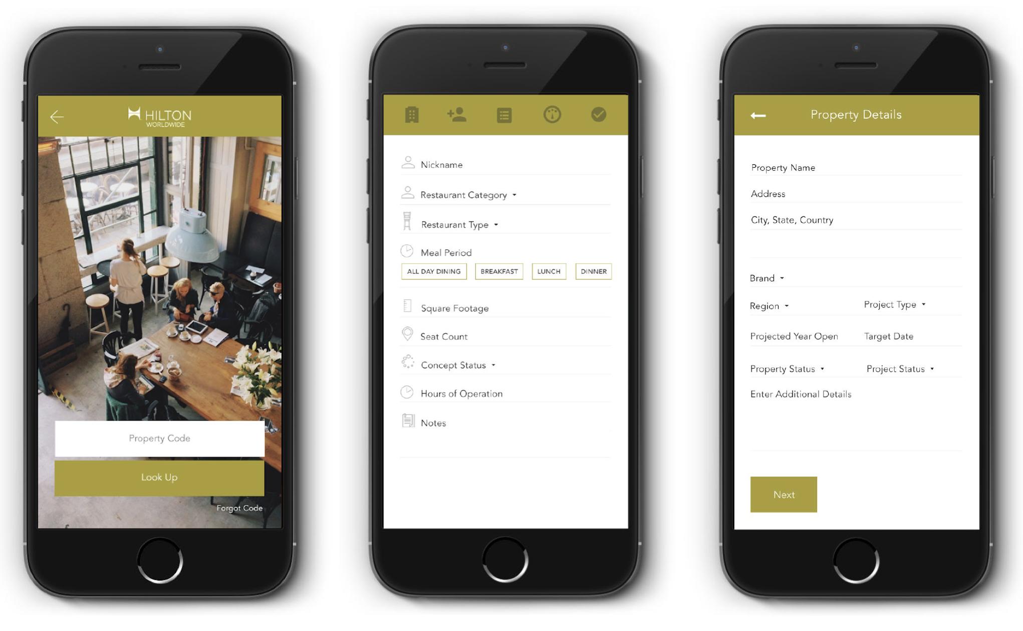
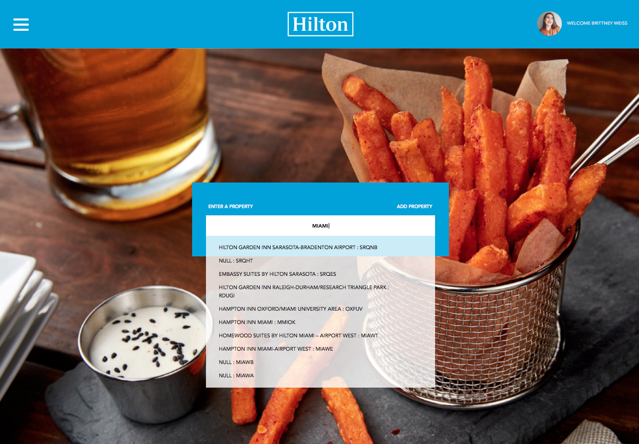
When users search the system for a property, if not already in their region's project list, they are now able to simply type in whatever information they have on hand - be it property name, a specific code, or a relevant piece of geographical data such as a city - and related properties will begin to pop up. Originally a person was required to recall a 5-digit code, one that most new properties don't even have yet. That was a lot to expect from our users.
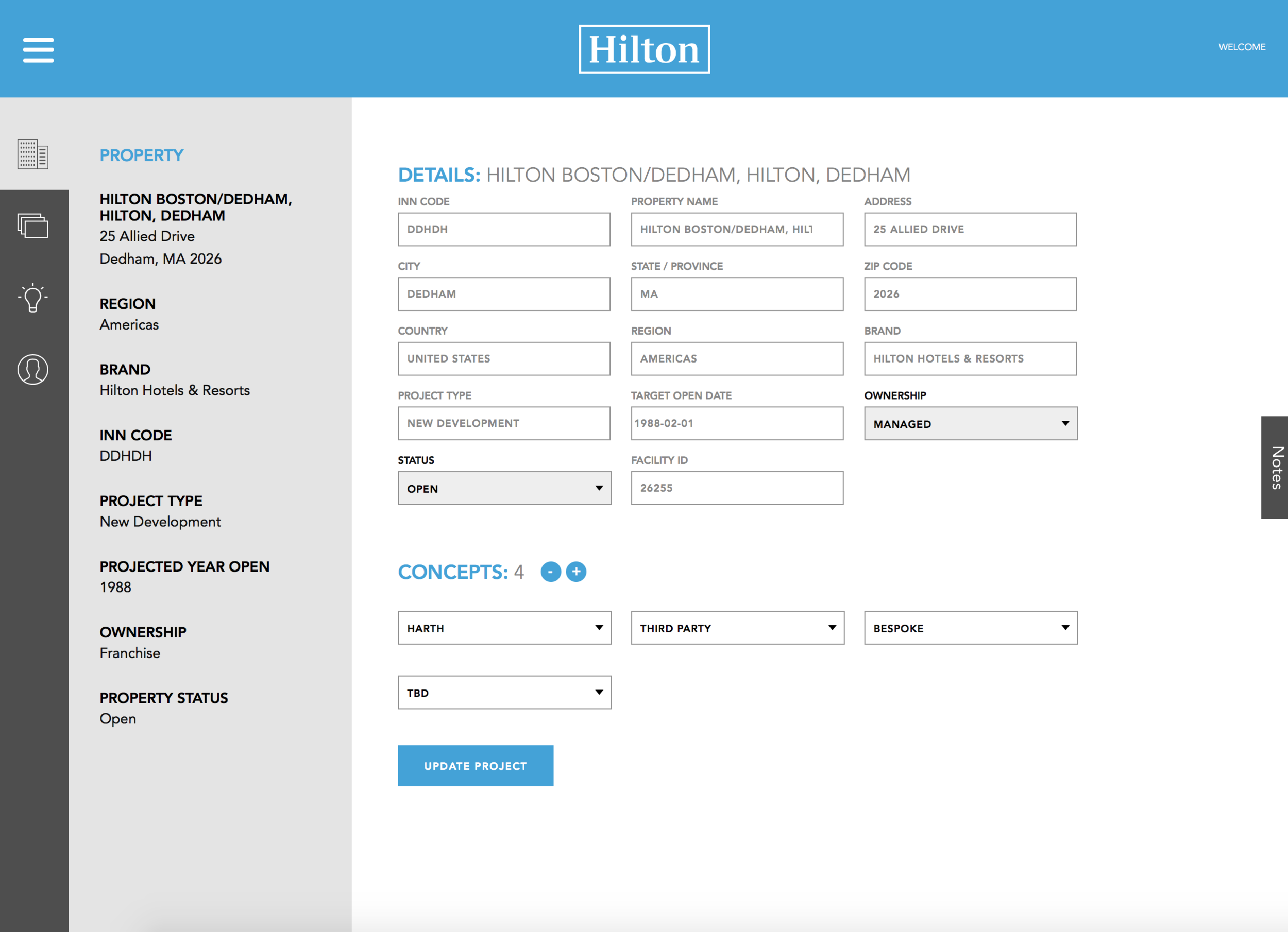
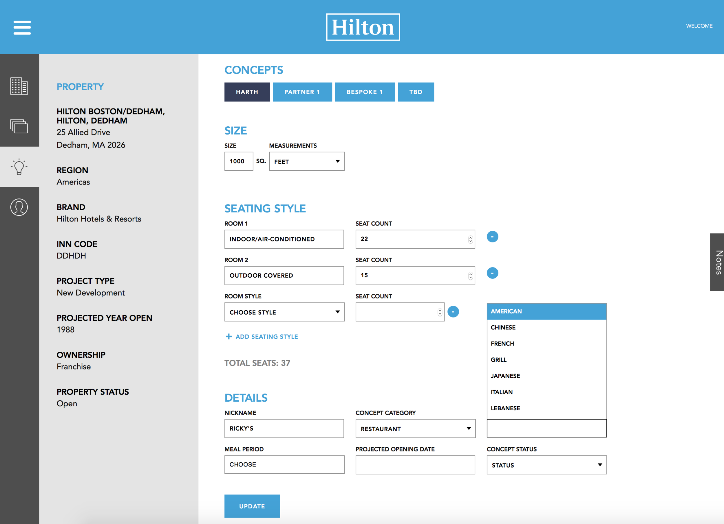
I was also able to switch the site to integrate directly with Hilton's Project Information Manager (PiM) system to pull APIs weekly for more accurate property data (and new properties), rather than the Salesforce system that only acted as a middle man. Once within a property, users can now see relevant overall data pulled in from PiM, in addition to being able to easily add or delete F&B concepts. A drop-down lets them select from a range of prototype concepts, bespoke, or partnerships and these selections affect the framework for inputting concept details on later pages.
Icons on the left-hand side now lead you from macro to micro information: overall property details, F&B overview of the entire property, specific concept details, and a collection of contacts.
On the concept details tab, users can click between the concepts they've added in order to fill out key details. From restaurant and cuisine type to seating styles and square footage, this data is rolled together and presented alongside other concepts for an F&B overview of the entire property (not shown due to current modifications being performed).
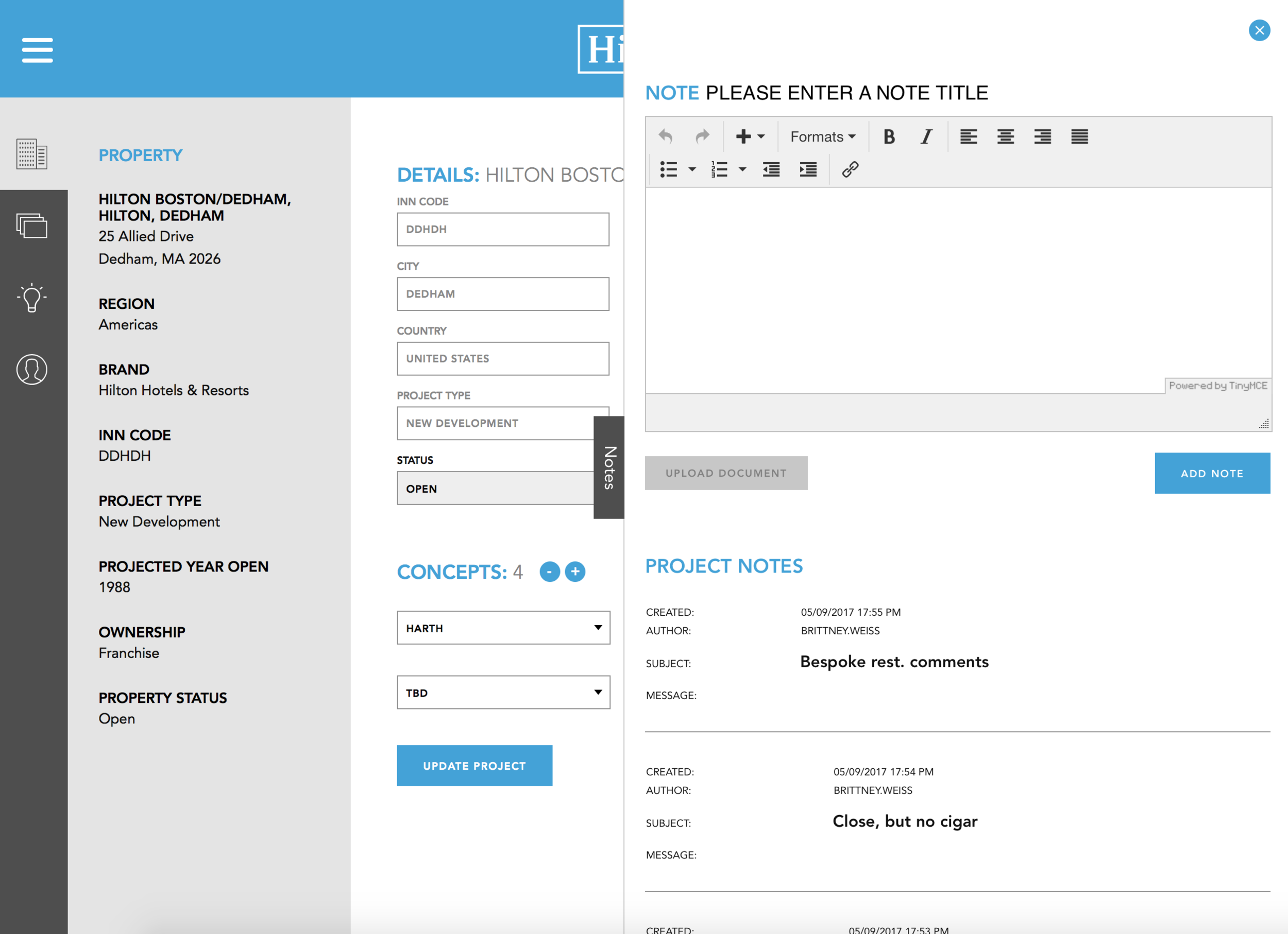
On any given tab within the property, users can now add timestamped comments via the pull-out Notes feature on the right-hand side, along with the option to attach documents. This will be one of the key features we look at during beta testing to determine if there is a more optimal solution, such as keeping all notes together but with a filtering feature.
Within the Contacts tab, users can scroll through the list of people affiliated with a property's refresh - be them consultants, owners, brand leaders, etc. Contacts can be updated and granted access to our digital library of concepts (a separate website).To make the site more useful while on-site with a mobile device, users can now simply scroll through their list of contacts and tap on an e-mail or phone number to quickly get in touch.
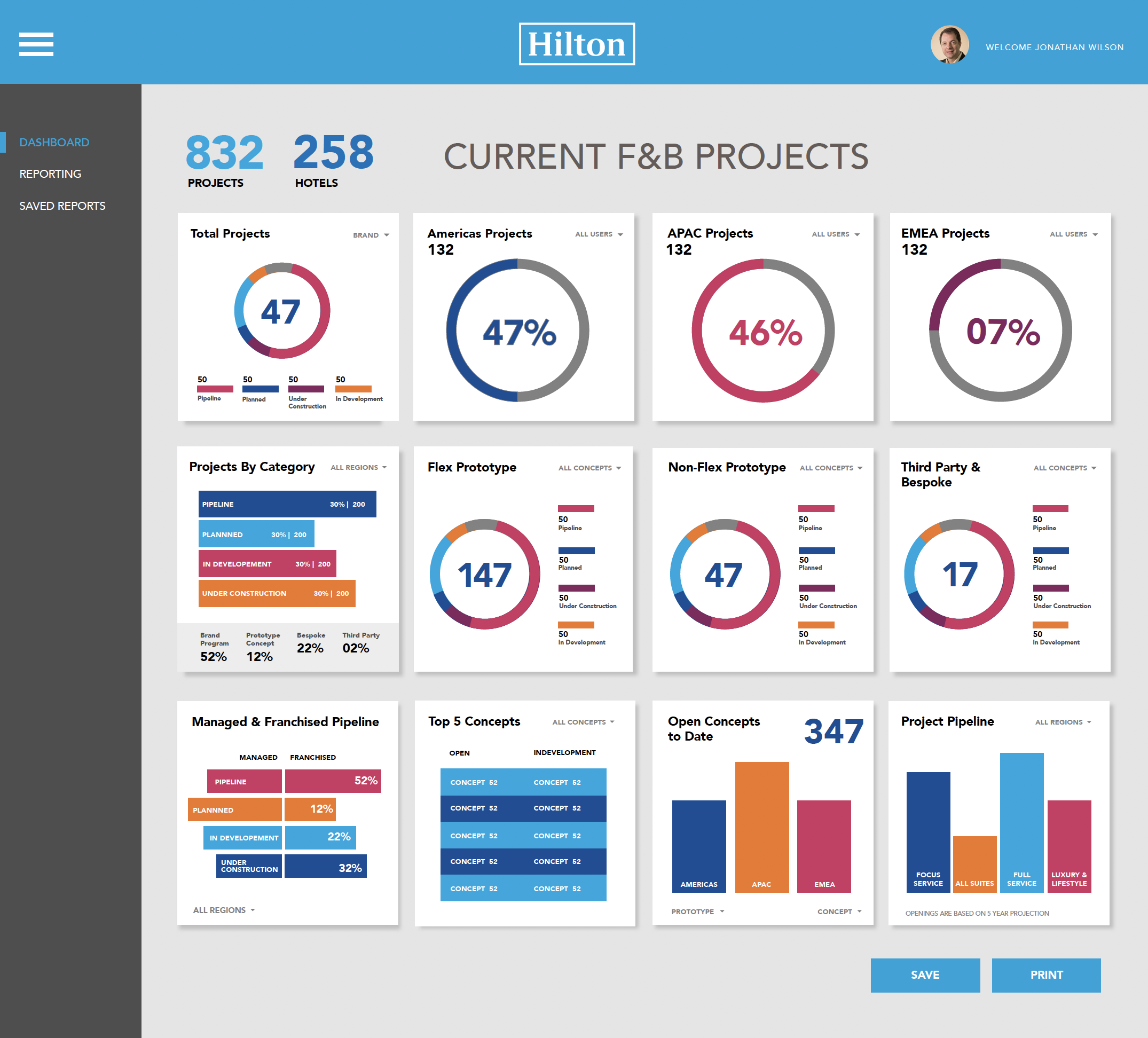
One of the most exciting features of the site is the Dashboard, which provides a snapshot of active projects throughout the world and also generates custom reports. We were asked to create a dashboard with appealing data visualization and went a step further to also ensure that reports could be saved as a .pdf and quickly dropped into presentations.
This feature is currently a work in progress. Note that the snapshot provided reflects a previous test iteration of the site - you'll notice 3 additional icons on the left-hand side. This was before I was able to condense and optimize the content.